super book
For my redesign of Super: The Work of Barbara Stauffacher Solomon, I created a fresh cover and interior layout inspired by Stauffacher Solomon’s bold typographic voice and clean, mid-century sensibility. The design pays homage to her iconic Supergraphics while introducing a refined, contemporary structure that highlights her work with clarity and confidence.


layouts
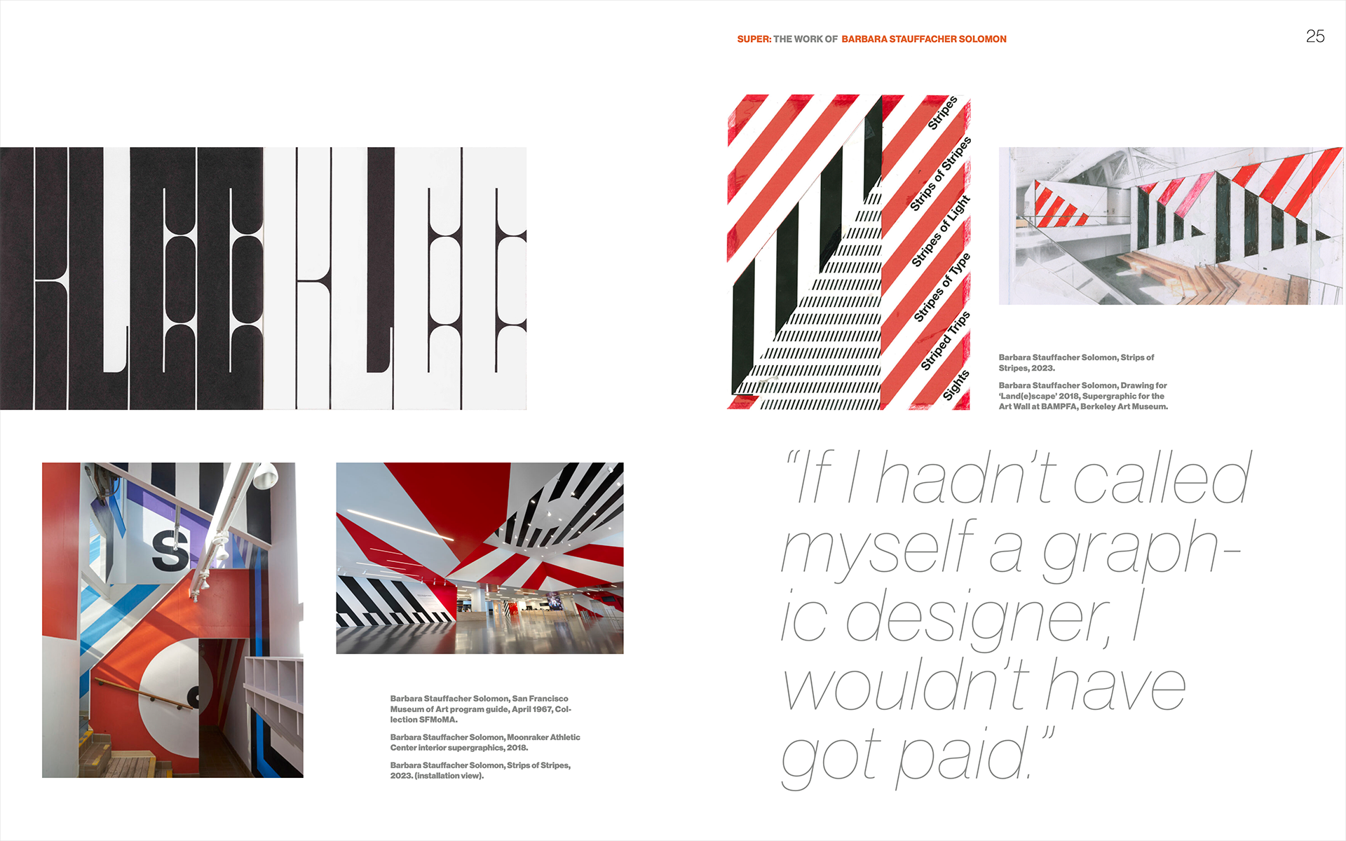
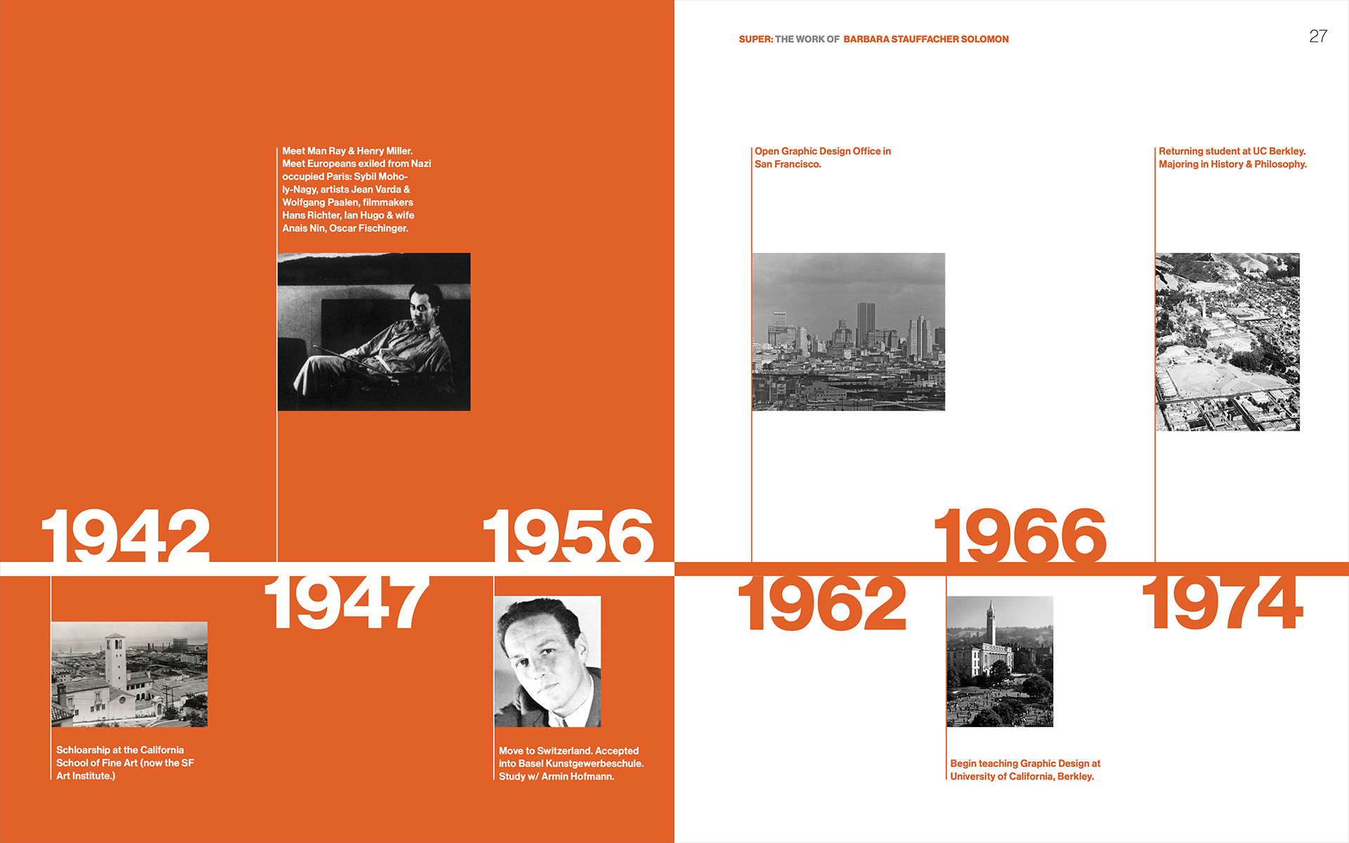
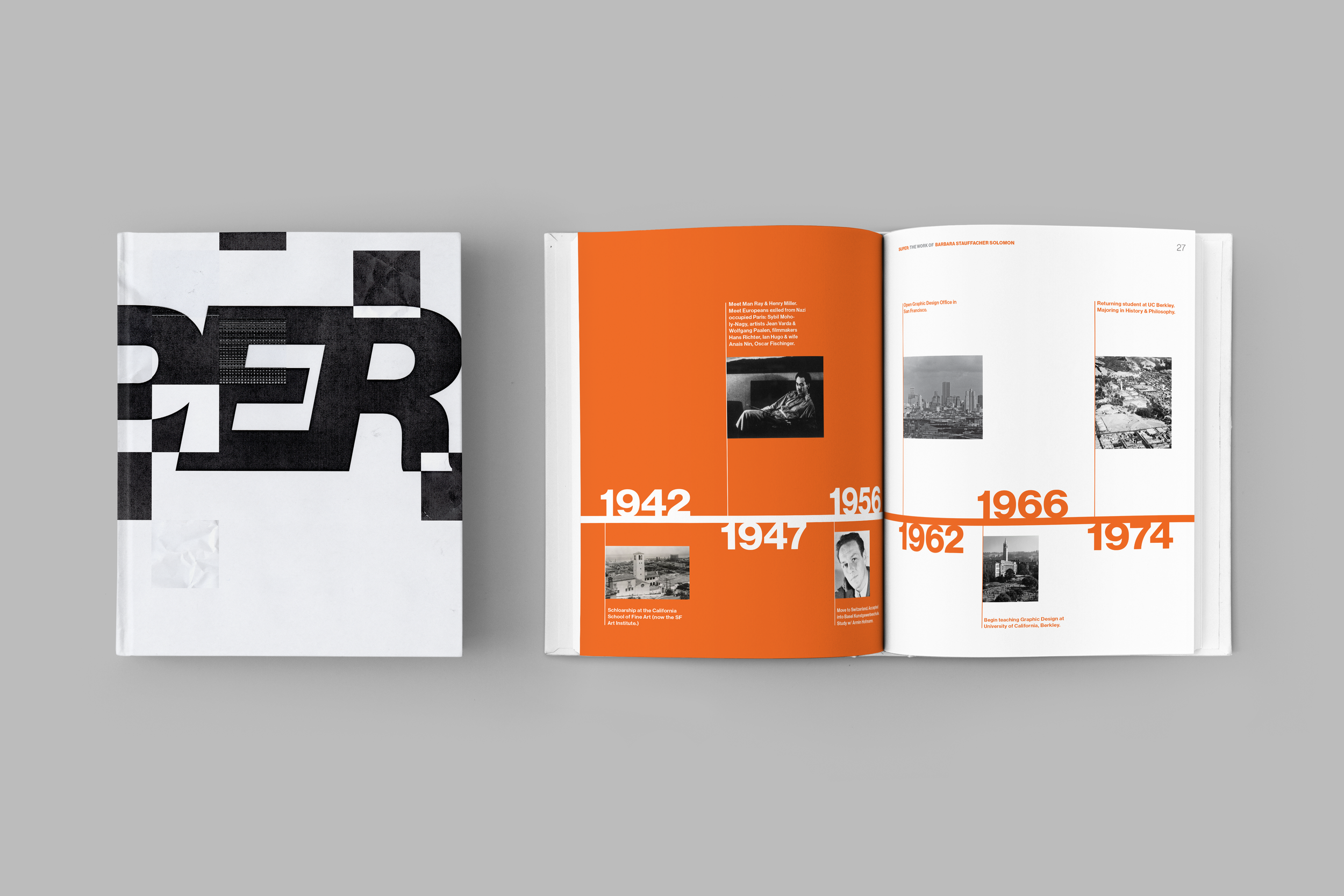
I developed a flexible grid system used throughout the book to create consistency while allowing the layouts to breathe. The structure reflects the clarity and order of mid-century modern design, guiding typography and imagery in a way that highlights Stauffacher Solomon’s work without overpowering it.
cover
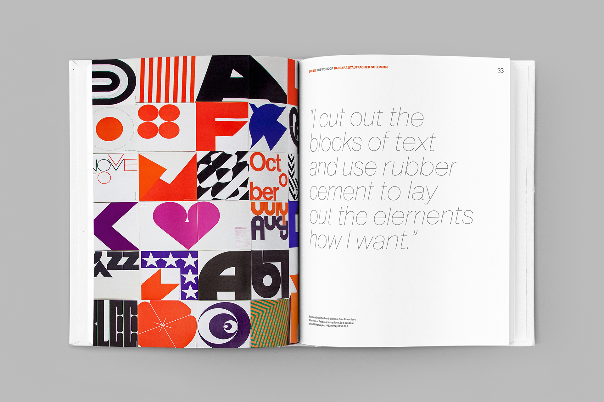
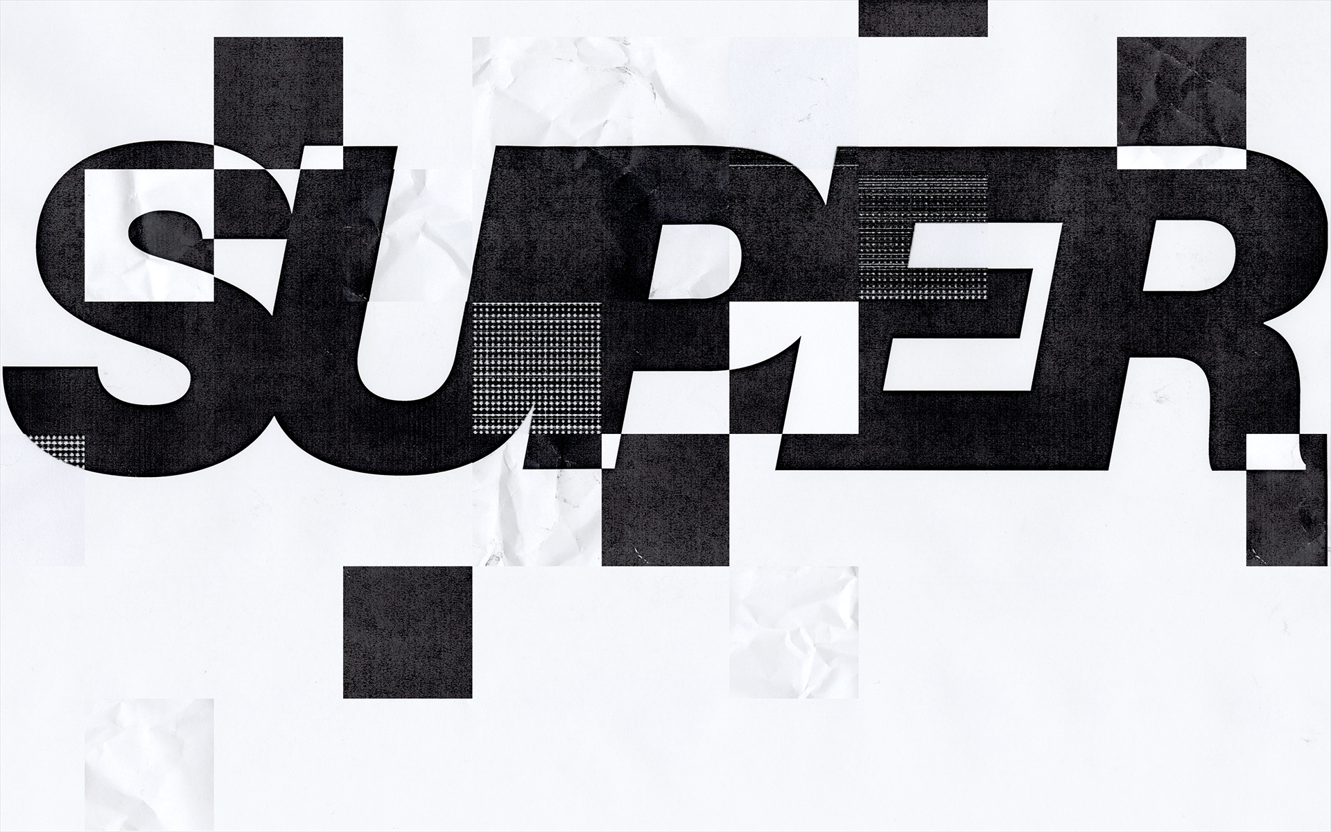
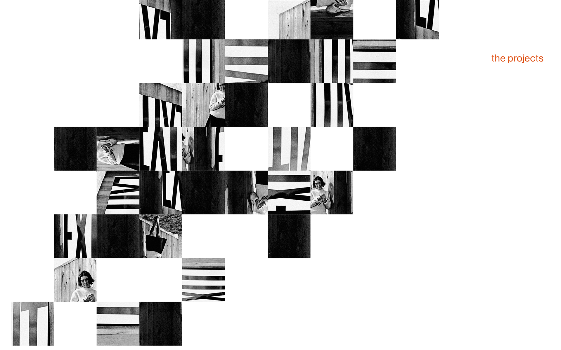
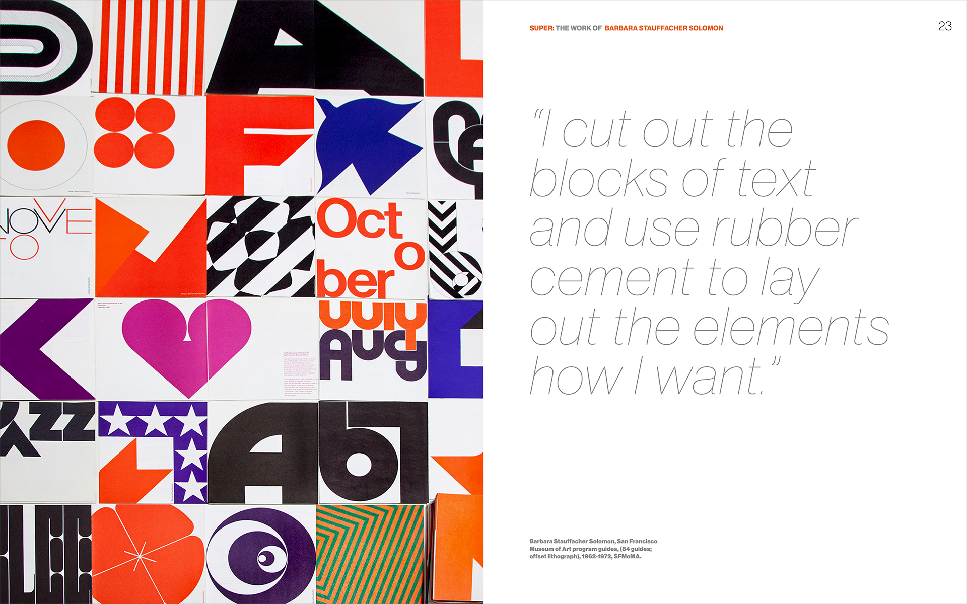
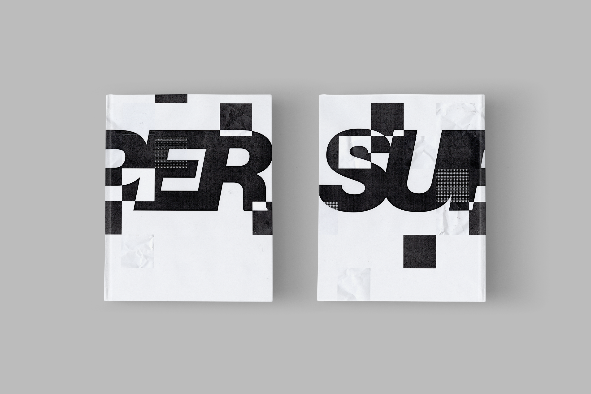
The cover design is inspired by Barbara Stauffacher Solomon’s cut-and-paste collaging process. I created multiple variations of the title treatment, printed them on a black-and-white laser printer to introduce natural texture and distortion, then scanned the prints back into the computer and assembled them into a layered collage. The result is a tactile, analog-influenced composition that reflects the energetic, hands-on spirit of her work.